The Washington Post: Chrome Extension
Redesigning the Washington Post's Chrome extension to build a habit with users and increase delightful discoverability.
Timeline
Summer 2022, 3 Weeks
Role
Product Designer & UX Researcher
Stakeholders
Laura Fisher, Design Lead
Jason Berger, Product Manager
Stephen Mefford, Product Manager
Karelia Jo Whitt, Product Manager
The Washington Post is an American news company aiming to keep their users informed about local, national, and worldly issues. One of their digital experiences includes a "new tab" Chrome extension. In 2018, it was initially released as an idea to showcase the breadth of content that the Washington Post offers, as the Washington Post’s brand perception is tied closely to politics. The other goal of the initial release was to increase engagement across the digital ecosystem.
Since the Chrome extension had not been touched in a few years, the Relevance PMs and my Design Lead identified an opportunity for me to explore additional ways that the Chrome extension can build a habit with readers while still driving the original goal of discoverability. From the start, success would be measured by increased user engagement with the extension and increased onsite visits.
To kickoff the Discovery phase of the project, I conducted an internal analysis, read user reviews on the Chrome extension store, and combined user analytics to identify creative opportunities for the experience.
From my internal analysis, I learned that clicking on the graphic brings the user to the article, but that was the extent to the experience, so I thought additional interactivity options and prominent CTAs would enhance the engagement of the experience. From reading user reviews, most people felt that the brights were very visually engaging and eye-catching. This was one point of success that I wanted to maintain within future iterations. Lastly, I learned that nearly 70% of all of the existing Chrome extension users are subscribers, which presented an opportunity to surface subscriber-only features.
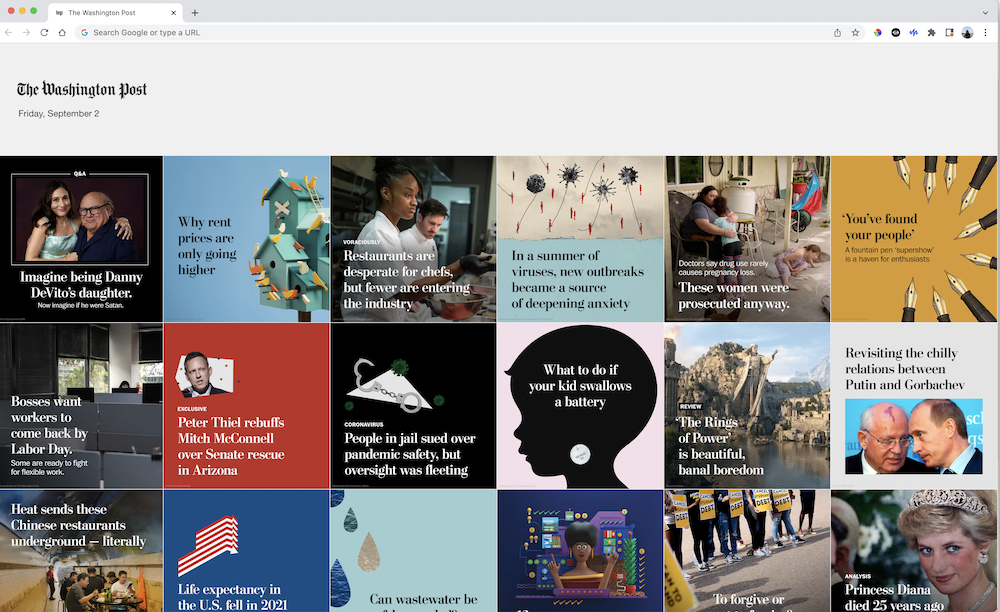
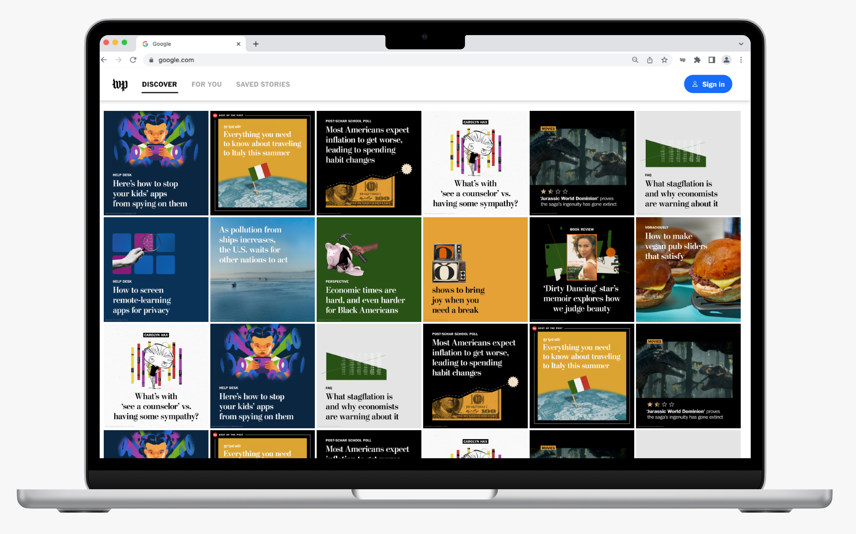
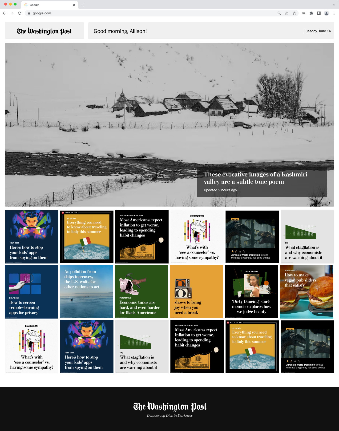
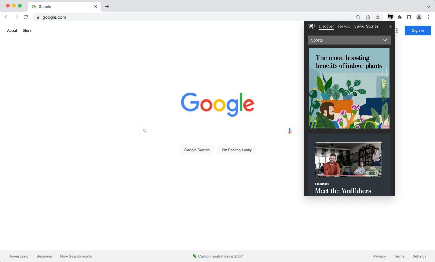
The Washington Post's current Chrome extension experience
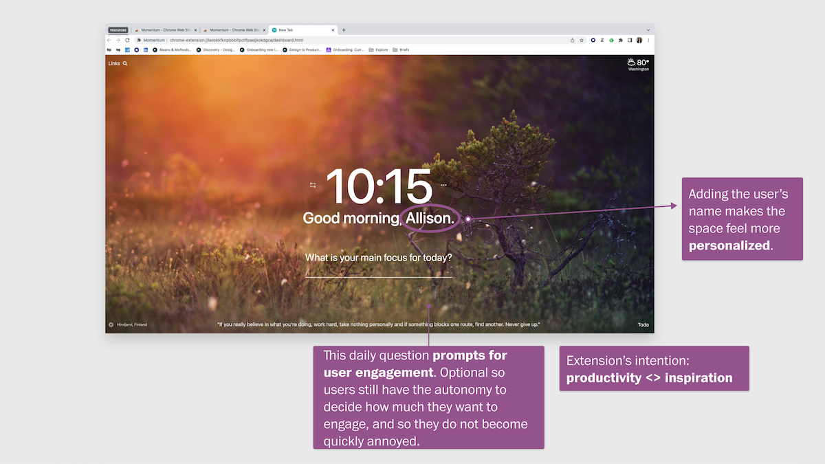
To take a pulse on how other extensions address similar problem areas, I looked into popular Chrome extensions who are considered to be the Washington Post's direct, indirect, and potentially encroaching competitors. I found that users resonated the most with experiences that had personalized and curated content based on their previous interactions. Furthermore, many experiences had optional avenues for engagement. Overall, I found that many users were seeking something that could be inspiring and motivating.
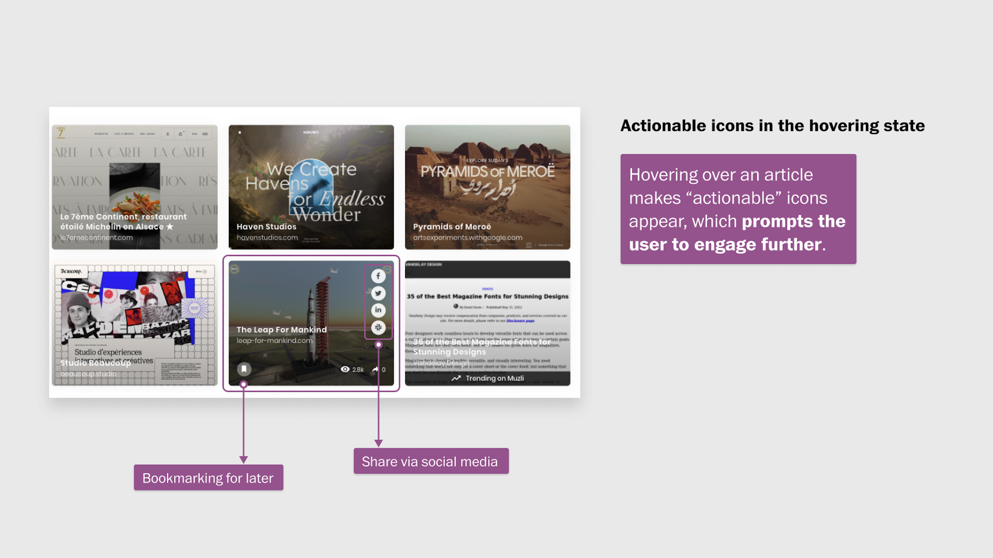
My annotations from Muzli and Momentum, two popular Chrome extensions.
With some preliminary areas of opportunity identified and as I started to ideate on potential design solutions, I thought through the lens of responding to business and user goals. Questions that ran through my mind include: “What features would encourage engagement? Add perceived value to users? Drive traffic to more articles? Drive recirculation?”
Two features that respond well to the said questions include personalized content and article action buttons, both of which are subscriber-only features. Featuring personalized content would make the experience feel more relevant to users, and thus, would increase user engagement. Article actions buttons, which includes bookmarking the article for later, sharing the link with the user’s social network, and gifting the article, provide low-effort avenues to encourage users to revisit the Washington Post at a later time or to share the Post’s content with potential new users across their network. Plus, with the integration of subscriber-only features, there’s another incentive for non-subscribed users to convert and form a relationship with the Washington Post.
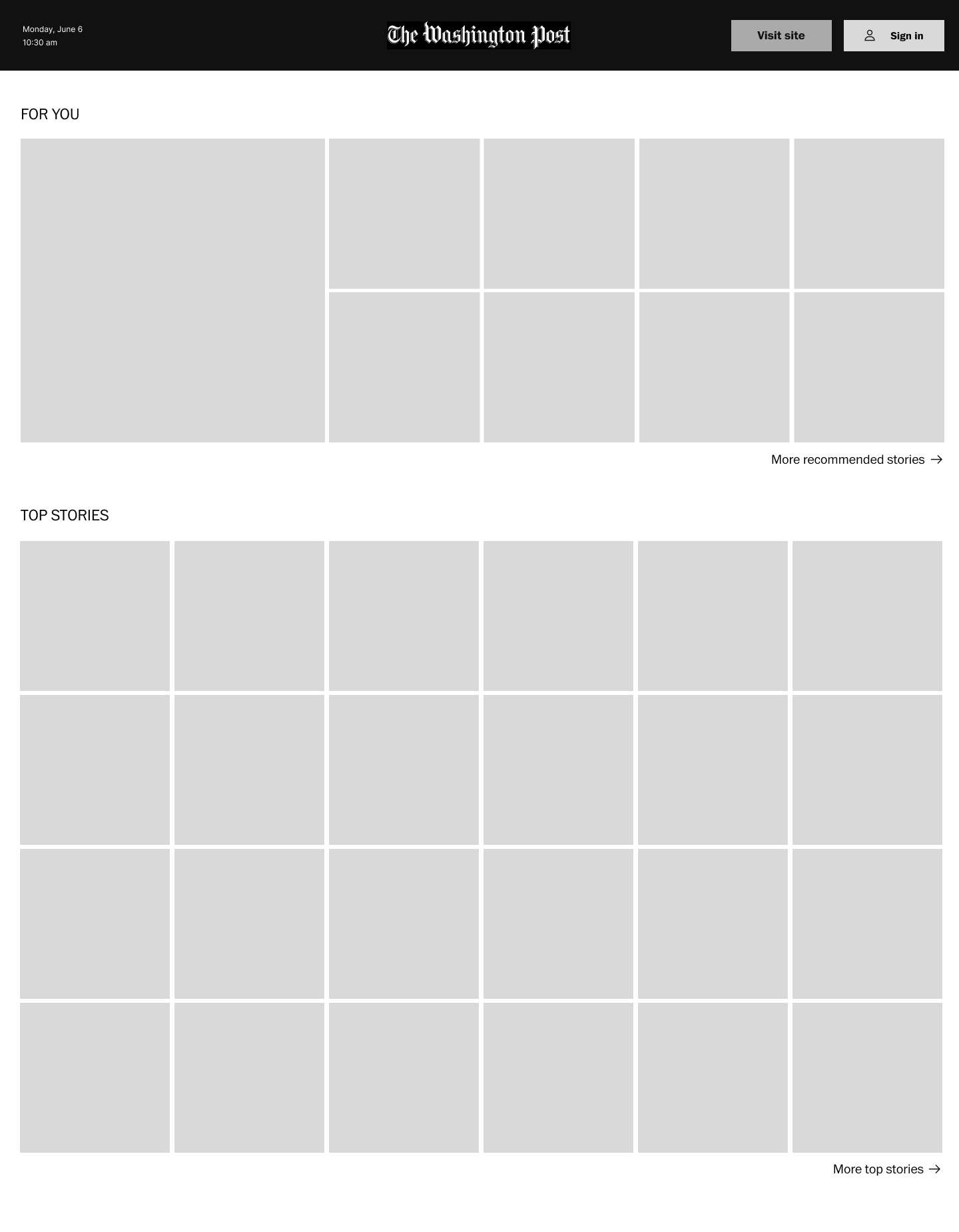
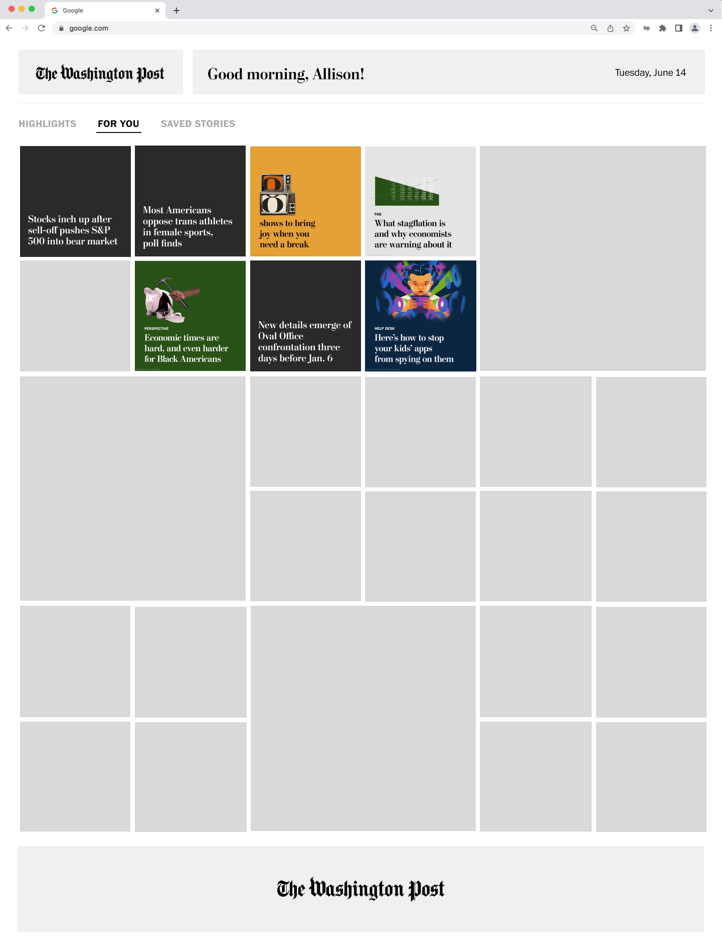
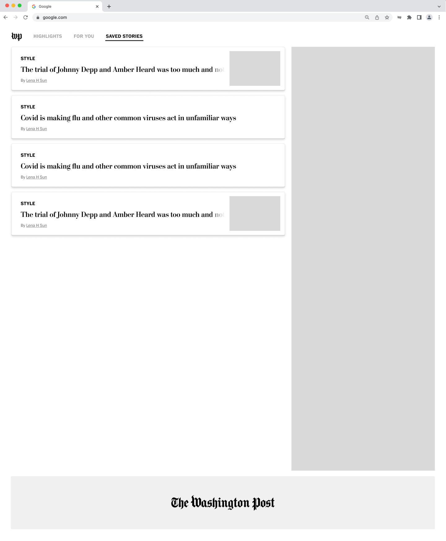
I explored various layouts to present the content sections: Discover, For You, and Saved Stories. I wanted the form of the extension to strike a balance between maintaining the original goal of discoverability while increasing users' engagement by populating relevant content.
Above: Wireframes from my explorations of a new full-tab experience.
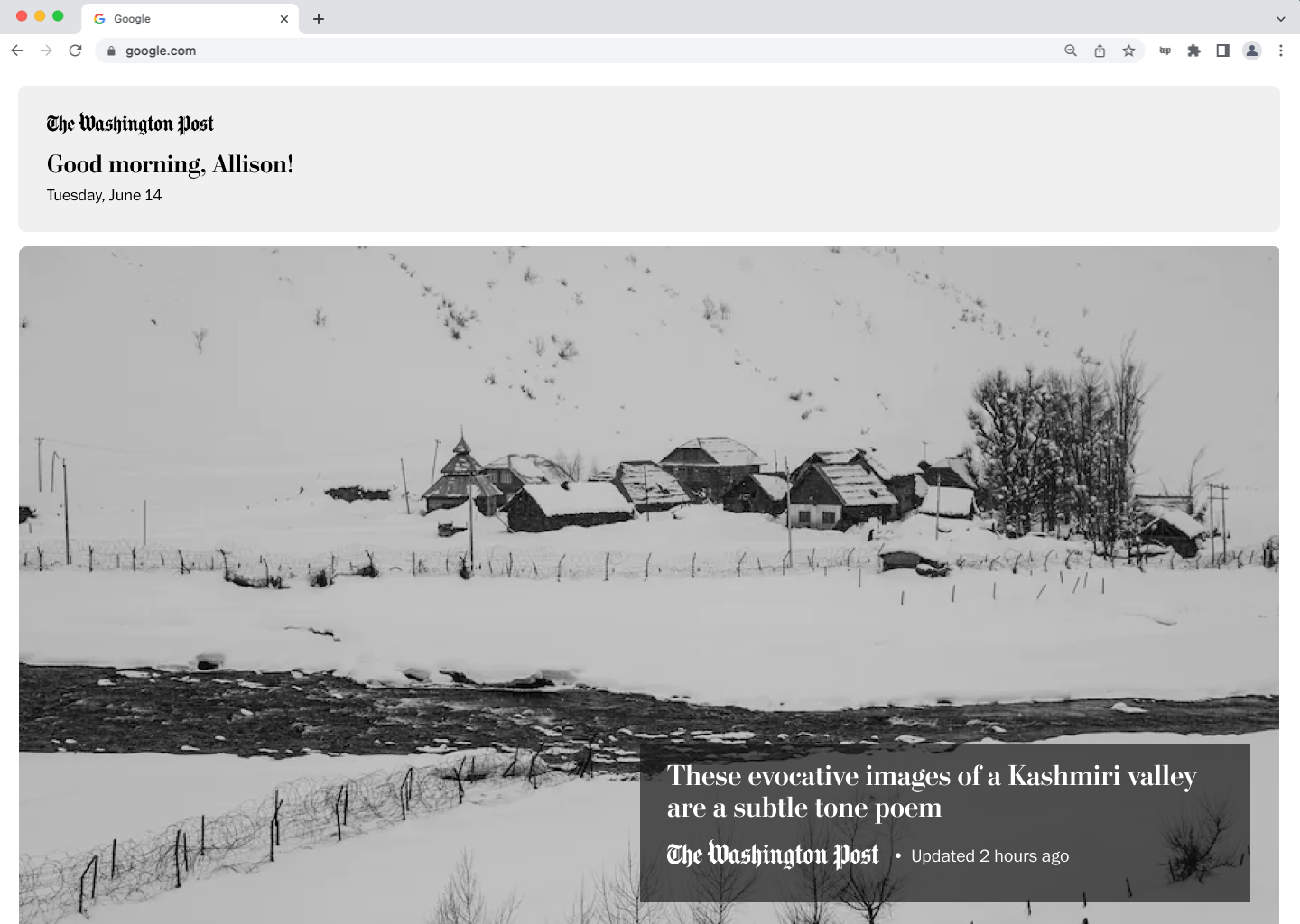
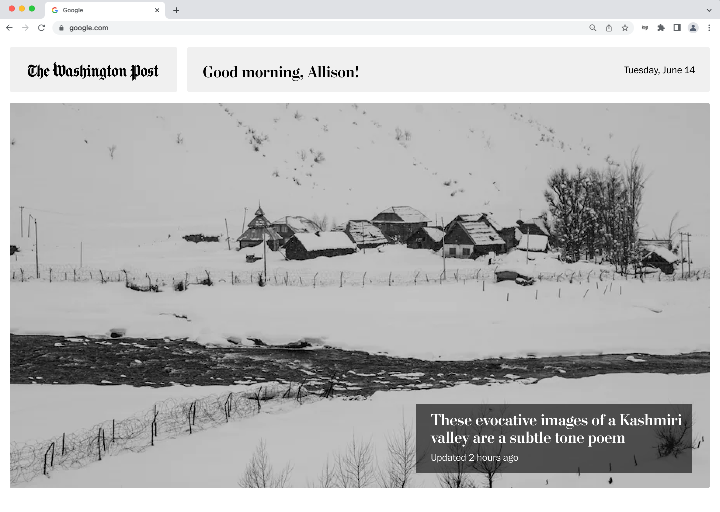
After exploring the idea of personalization and article actions, I wanted to diverge into different types of content and especially focus on how to expand the perception of the Washington Post’s brand. Based on the research insight pointing to users wanting to feel inspired and motivated, I leaned into multimedia by featuring the Washington Post’s photography content. Each day, a new image would be featured, and the article brights would remain underneath. In my wireframes, I explored different formats to display information about the photo, as well as add a personalized header.
When working on this project, I had the Washington Post’s Chrome extension downloaded. For me, it was frustrating that it spanned the entire new tab and I couldn’t access any of the default Google Chrome capabilities. I thought more about how the Chrome extension store is already saturated with so many products, and users can only have one “new tab” format downloaded at once. Because of this, it would restrict the number of users who would download the Washington Post’s Chrome extension and may lead to an increased number of users eventually deleting it.
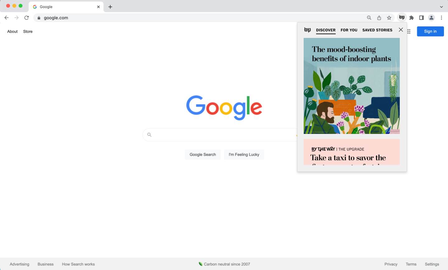
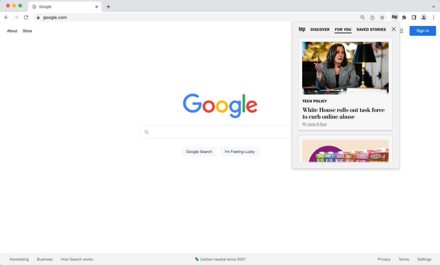
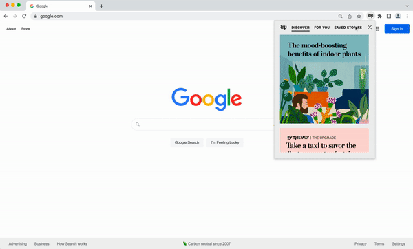
Diverging even further from the current experience, I thought to create a lite pop-out experience that is accessibly by clicking on the Washington Post’s widget next to the search bar. This solution would potentially strike the level of engagement that an individual user desires and achieve the original goal of discoverability without forcing users to choose between Chrome extension products.
Above: Wireframe iterations for the lite pop-out experience. Explorations of a dark mode, too.
Since the lite pop-out experience deviated the furthest from the existing experience, I wanted to understand its perceived value and identify additional areas of improvement. If I had more time, I would test the other concepts. I launched an unmoderated research study on usertesting.com to a diverse range of participants who are Washington Post subscribers and Google Chrome users. My insights include:
1. Users like how accessible the extension feels without being too overwhelming or distracting.
2. Users cited feeling “news fatigue” as a reason to not engage with the news, and the lite experience provides the autonomy to control their level of engagement.
3. Users found the personalized “For You” section to be the most valuable.
4. Many users said that they tend to bookmark things but forget to return to the content later on, so this was an important user behavior that I wanted to account for in my next iteration.
One user went so far to say: "I would 100% download this immediately... I like that it gives me [a] choice on when I want to browse, but the fact that it’s right here - that it only takes up a part of the screen - I like that a lot."
I continued to iterate on my design concepts and collected critique from designers on the team. In the end, I presented high-fidelity prototypes to the project stakeholders.
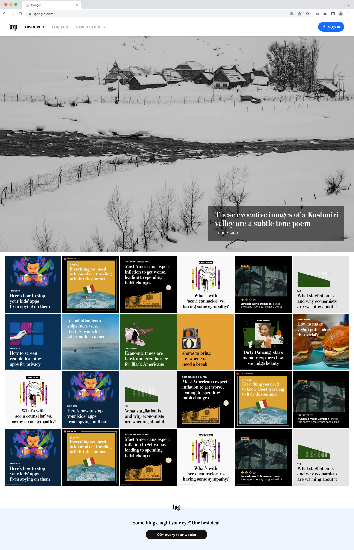
I focused on curating a personalized experience with the three-tab layout. I chose the Discover tab with the article brights to be the default page to maintain the original goal of driving discoverability. I placed suggested stories and save stories on the following tabs. Because of the integration of subscriber-only features, I designed a few edge cases, including but not limited to non-subscribed and non-registered users.
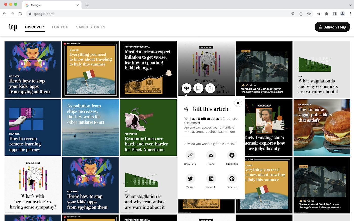
Discover & Article Actions: The article actions module appears when the user hovers over a bright and clicks on the gift icon.
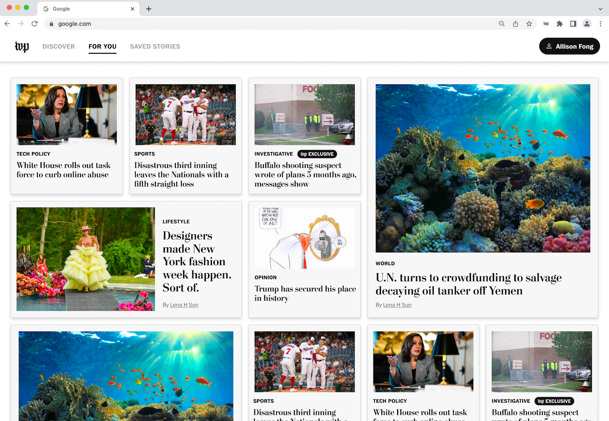
For You, which features curated content based on the user's reading habits.
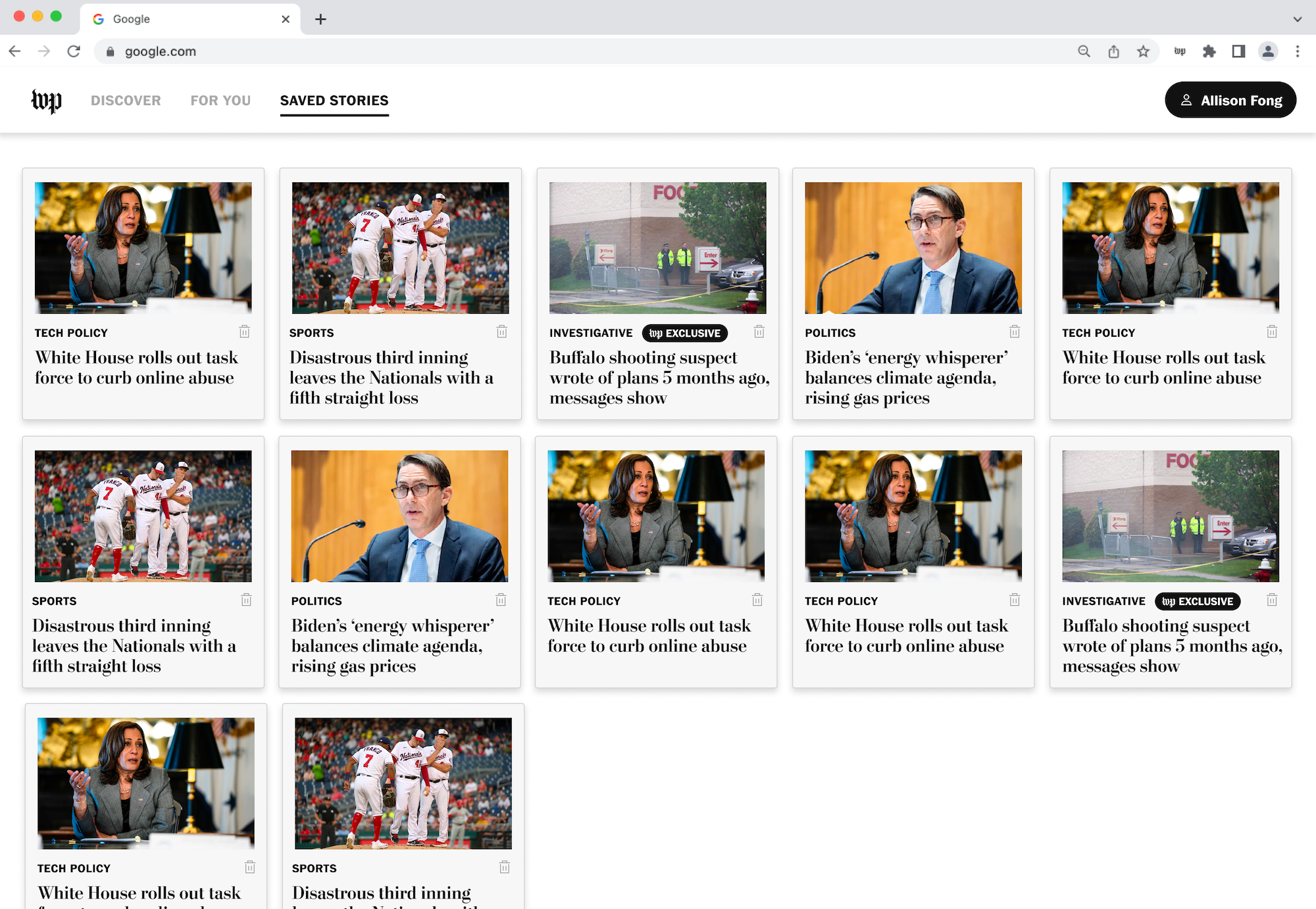
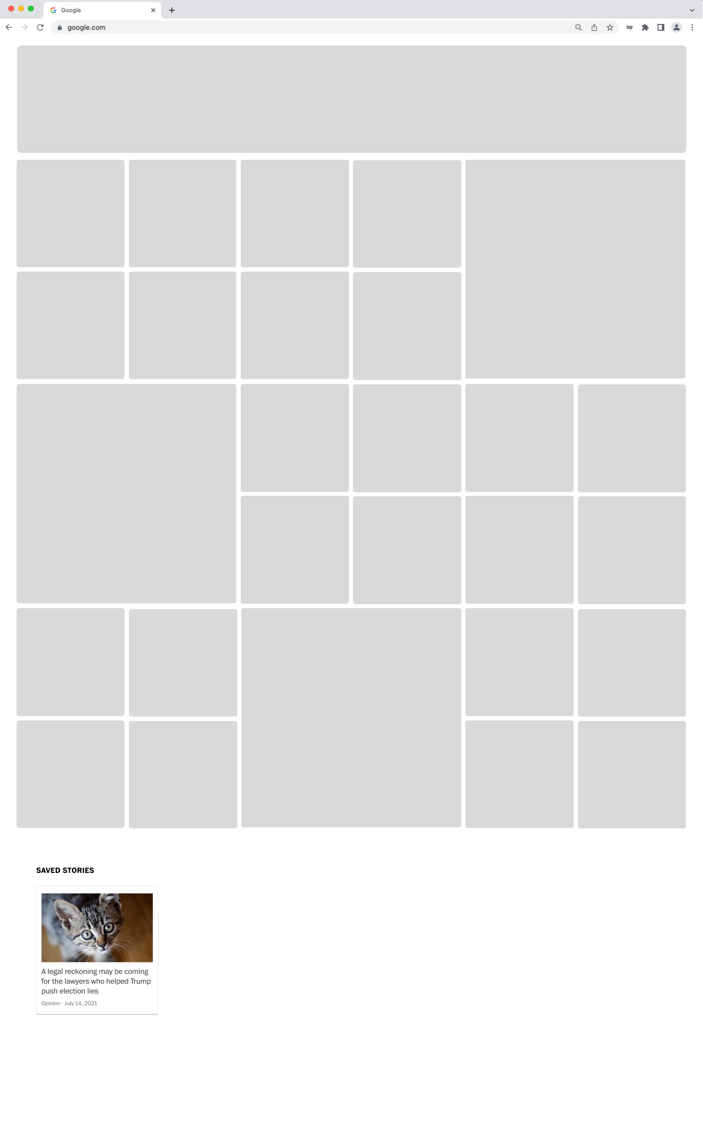
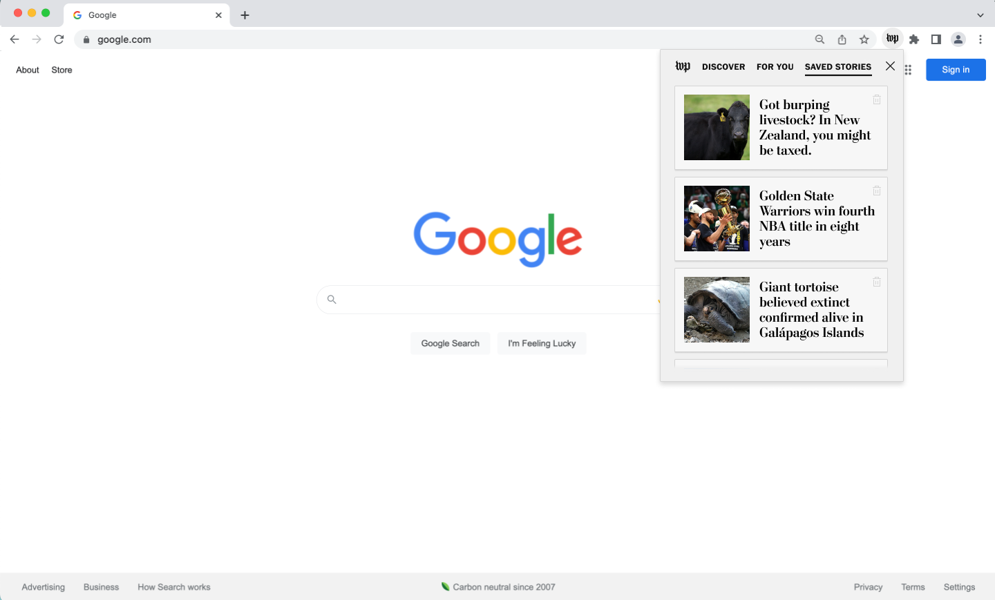
Saved Stories
An example of how users interact with the full-tab experience.
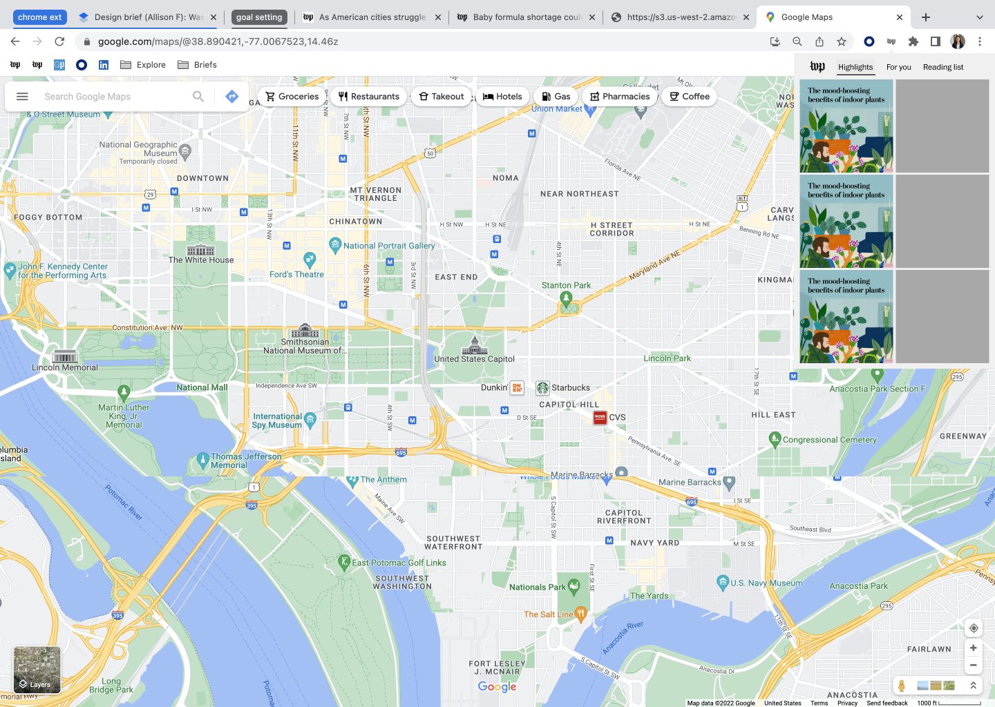
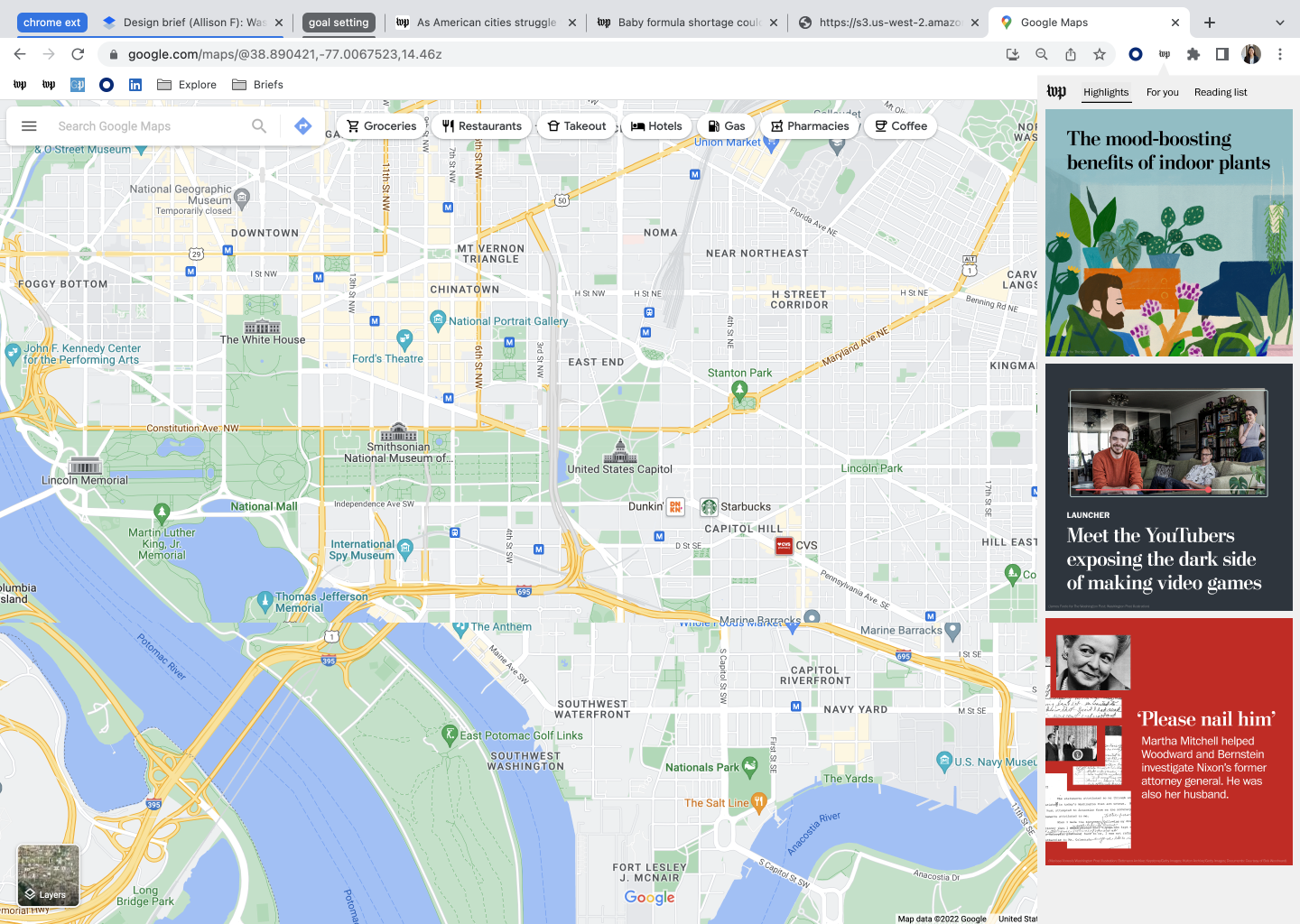
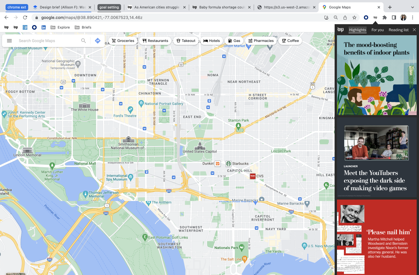
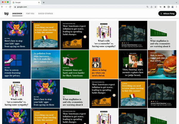
Mimicking the full-tab experience with personalized content and article actions, I integrated a full-bleed photo from the Washington Post Photography section.
After learning about the common user behavior of forgetting to return to bookmarked items or things that are not visible all the time from the desirability test (which I’m also guilty of!), I made sure to include an indicator on the Washington Post widget that new content was added, which would prompt users to initiate engagement. After presenting my design solutions and discussing with the stakeholders, the PMs liked the idea of the pop-out experience as a follow-up product to the new tab experience, which allowed users to have options on their level of engagement.

Discover
For You
Saved Stories
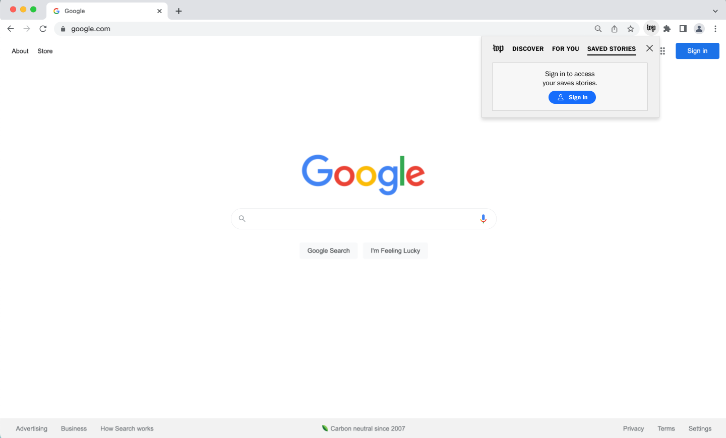
Edge case for a user who is not signed in yet.
Due to the time limitations of my internship, I was not able to cover everything I would have liked. My suggested next steps would include conducting A/B tests with users to validate my redesign concepts. In this case, success can be measured by article click-rates and an increase in overall site engagement.
( 1 ) The importance of contextualizing user research questions. The first time I launched my unmoderatedusertesting.com, my prototype instructions were too vague. Unfortunately, all of the participants provided feedback on the default Google search engine and not on my Chrome extension designs. This minor setback and the process of relaunching the test provided me with a second opportunity to reevaluate both the test instructions and questions, which resulted in more focused, valuable information that informed later designs. From this experience, I hope to refine my research skills starting with providing enough contextual information for participants.
( 2 ) Divergence can lead to unexpected inspiration and opportunities. Had I not invested so deeply in the exploration of different ideas, I’m not sure if I would’ve thought about the lite experience. Furthermore, divergence allowed me to holistically weigh the trade-offs of each concept. I hope to carry this mindset and its accompanying excitement for new possibilities into future projects!
( 3 ) Practicing the skill of asking for pointed feedback. I took this project as an opportunity to learn how to ask for more specific feedback depending on stage of the design process or the problem that I was grappling with.