The Washington Post: Watch App
Collaborating with co-interns to implement a 0-1 iOS and Android watch app for the Washington Post with the goal of increasing reader engagement beyond traditional web and mobile platforms, building a habit with users, and adapting to users' need for accessible, instantaneous information.
Timeline
Summer 2022, 3 Weeks
Team
Caitlyn Baensch, Product Designer
Lisa Ly, UX Researcher
Jalen Chavers, UX Researcher
Matthew Turk, iOS Engineer
Hoang Nguyen, Android Engineer
The Washington Post is an American daily newspaper providing readers with updates and information about local, national, and worldly issues. The news industry has increasingly turned digital, and most of the Washington Post’s traffic comes from mobile users. It is clear that users access information when they are on-the-go.
In an attempt to adapt to changing habits and take an innovative approach, the Washington Post’s technology leaders wanted to expand their platforms to include Apple and Android watch apps. By designing a news experience optimized for the watch, our goal was to build a habit with users, display the breadth of content that the Washington Post offers, and increase overall engagement.
To kickoff the project, the UX Researchers conducted an unmoderated research study with 6 participants who are Smart Watch users and self-identify as someone who frequently engages with the news. The study aims to understand the type of news content users would find the most valuable, identify patterns and interactions that continuously engage users, and discover opportunities that the watch uniquely offers that other modalities cannot regarding news consumption.
From our research, our key insights include:
( 1 ) All participants cited the importance of seeing breaking news and story headlines to feel updated.
( 2 ) Most participants would likely look at pictures and skim headlines on a watch.
( 3 ) Users had mixed responses to reading an entire article on their watches, as opposed to a snippet or preview.
( 4 ) Some participants stated they would prefer listening to an article from their watch, as opposed to reading.
While the researchers were conducting the unmoderated study, my design colleague and I conducted an audit of 14 Apple Watch apps that are direct, indirect, and encroaching competitors to the Washington Post. We identified the strengths, weaknesses, takeaways, and common trends in regards to the visual design, information architecture, and features to include in our own app.

Matrix for identifying the strengths, weaknesses, takeaways, trends, and a screenshot for each competitor

Analysis of the NBA watch app
Following our comparative analysis and the unmoderated research study, we translated the key insights from both into creative opportunities. During this process, we weighed what features would be essential to the basic functionality of the app, what users would find most valuable, and the feasible amount of lift communicated by the developers. This resulted in feature tiers: Need in MVP, Nice to Have, Save for Later, which helped to limit the scope of the next stage of the design process. Some creative opportunities that we wanted to explore further and verify its technical feasibility included personalized content, bookmarking articles, and generating a newsfeed based on the user’s current location.
A high-level consideration we made during this stage of the process was our decision for the Smart Watch app to work in tandem with users’ mobile app, as opposed to a stand-alone experience. This choice would allow the app to deliver relevant information while accommodating the users who would not prefer to read an entire article from their watches, given the limited interface.

A snapshot of the workspace we used to organize, categorize, and rank the features.
Caitlyn, my co-designer, and I mapped out the app’s information architecture and only included the features in the “Need in MVP” tier from our synthesis. It displays how the user would experience the app and what they would see on each page with special consideration paid to the order of the sections and each section's respective interior pages. It also lists the content available at the end of each page, including but not limited to a Next Story button and a note about how to access the content on the user's iPhone (Handoff).
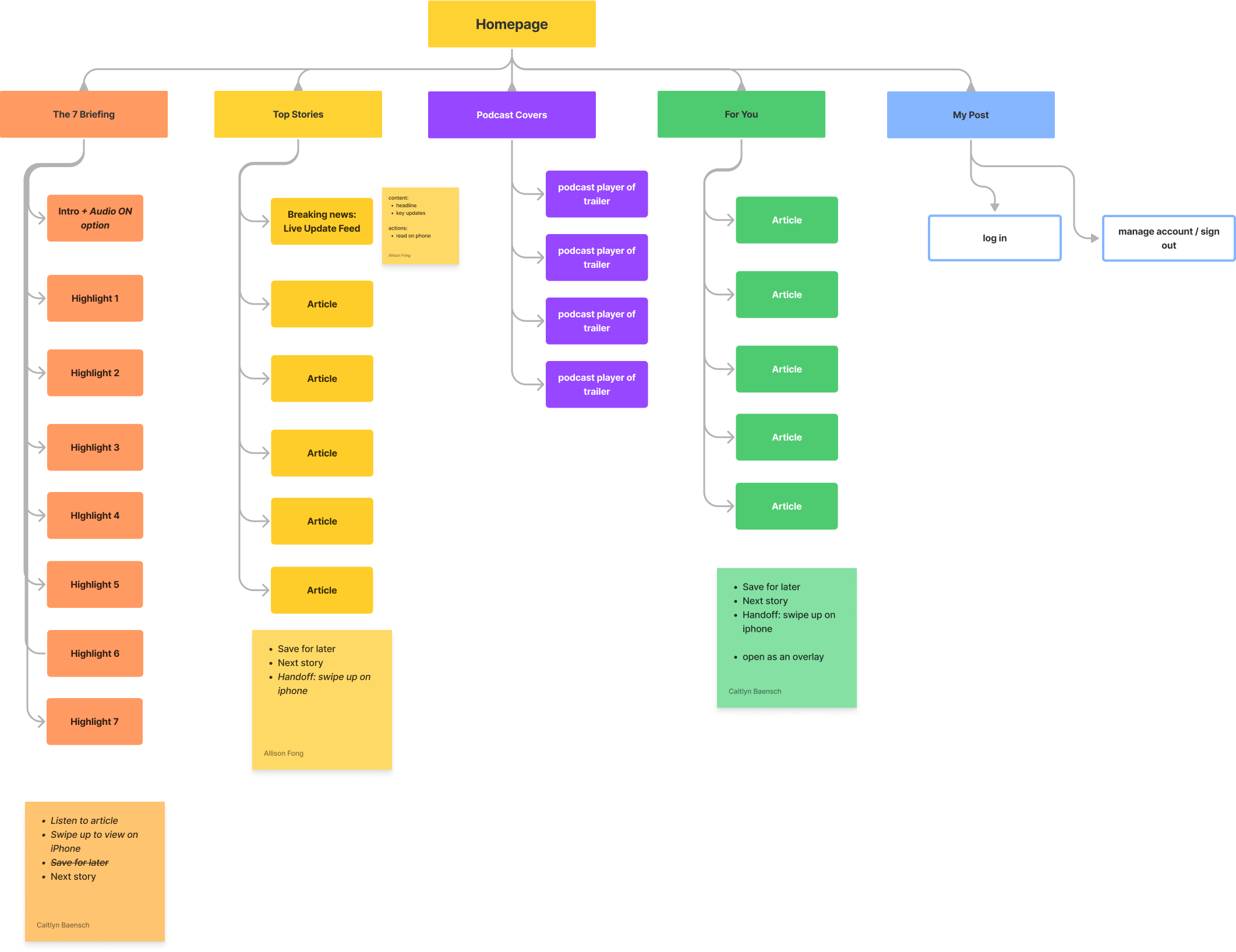
The app's information architecture outlining its sections and content.

Consideration of the user flow where they enter the experience from a notification.
Caitlyn and I delegated certain features of the app to design to each other. I primarily focused on designing The 7 Briefing and the Live Update Feed experiences. Caitlyn iterated upon the podcast preview and reading experience, which included the Top Stories and For You sections. We met a few hours each day to sync up and provide updates on progress, collaborate, and provide feedback.
The 7 Briefing is a rundown of the 7 most important and interesting stories delivered to users each morning and can be accessed via email, mobile app, and on site. The choice to include The 7 Briefing in the watch experience was largely due to its existing parsed-down format with a digestible amount of information: a one-liner headline and three bullet points.

The current The 7 Briefing experience on mobile.
When designing this feature, I focused on the pacing of the experience and experimented with how much content should be displayed at once and how the user accesses the different types of information. I translated the format from site into the watch experience; each “slide” or page of the feature displays the headline, and scrolling down on each page presents the three supporting bullet points. This amount of content accommodates users who prefer only to read the headlines as well as those who want to dive deeper. Based on users’ desire for multimedia, we also included an option to listen to The 7 Briefing.

My iterations for The 7 Briefing. Experimenting with audio toggle placement and pacing.

High-fidelity prototype for The 7 Briefing.
The second feature I focused on was the Live Update Feed (LUF) format. Across the Washington Post’s digital ecosystem, it is used to convey information as a breaking news story unfolds in real-time. The LUF includes timestamped updates and three summarizing bullet points.

The current LUF experience on desktop.
The choice to include the LUF was in response to all of the research study participants indicating their desire to see worldly, breaking news, and the LUF is one of the most important ways that the Washington Post relays said information. Watch app LUFs can be accessed via push notifications or from the list of Top Stories, as indicated by a red circle and “Live Updates” tag. From there, the user would be able to read the three key updates and swipe through timestamped updates in a card format. The interaction of swiping through cards allows users to focus on and digest each piece of information.

My progress iterations. I was considering different formats to best convey the information.

High-fidelity prototype of the LUF format designs.
Caitlyn and I presented our initial designs and prototype of the features to the developers. We quickly learned more about the technical constraints and realized that implementation for certain features would not be immediately possible. For instance, the Washington Post does not have the data to support live update feeds on the watch, and the process of authenticating users and identifying their subscription status would entail a much larger lift than was realistically feasible given the project’s timeframe.
Upon learning of said constraints, we worked with the engineers to determine the most essential, technically-feasible features and defined the three phases of development. I went back to adjust the designs to reflect these changes and delivered annotated designs to the engineers via Zeplin.
The Top Stories section will be filled with relevant breaking news articles and evergreen stories. All users would be able to access snippets of the content and encouraged to continue reading on their mobile devices.

Welcome

MVP: Home

Top Stories
The MVP Plus version includes personalized curated content in the For You section, subscriber-only features that includes My Post, and The 7 Briefing.

For You

My Post

The 7 Briefing
The ideal state of the watch app for the far future. The Top Stories section includes articles in the live update feed format with three key updates and timestamped minute-to-minute updates as they are published.

Finalized post-MVP prototype
Due to the time constraints of the project, I did not design high-fidelity mock ups for the circular Android watch faces. I served as a consultant to the engineer working to implement a similar experience on the Android Wear OS ecosystem. The two main challenges were adapting the visual designs originally meant for square interfaces to a circle and translating the Apple Watch visual and interaction patterns to the Android's. The majority of the interactions, were the same, but in some instances, we opted for more interior pages for a seamless user experience. I looked into Material Design for Wear OS↗︎ system for suggested type and visual design guidelines.
Caitlyn and I delivered two high-fidelity prototypes as guidelines to visualize the desired visual designs and interaction patterns. One prototype was the MVP version that all stakeholders agreed upon, and the second prototype is a far-future vision for the Washington Post’s Smart Watch.
The experience is currently in development! This will usher the Washington Post’s expansion into devices past traditional web and mobile formats. My internship at the Washington Post has sadly come to an end, but if I had more time to work on the project, I recommend taking the following next steps to continue improving the watch app experience:
( 1 ) Usability testing of the MVP to understand users’ pain points and iterate on them. I would want to learn how many sentences need to be read to intrigue users to continue engaging with an article and how to improve the tandem relationship between the Apple Watch and mobile app experiences.
( 2 ) Exploration of more opportunities to integrate multimedia to create a richer user experience.
I had so many fun firsts with this project! I had the pleasure of collaborating with a team of dedicated researchers and developers, as well as merging my brain with the talents of another Product Designers. At times, it was a juggling act to balance each stakeholder’s vision. In the end, I’ve come to appreciate the reevaluations and pushback, as they allowed me to explore different avenues and practice advocating for users’ best interests via design solutions.
If I had the opportunity to restart the process again, I would have initiated conversations with the developers earlier. Having a clearer understanding of the technical constraints would have allowed for smoother hand-offs and the opportunity to flesh out more design concepts on a smaller set of features.
Lastly, intentionally designing for a smaller interface pushed me to cultivate an immersive experience by maximizing the range of available interactions users can have with their device, such as scrolling, swiping, and twisting the watch’s crown. By doing so, my perspective shifted to think beyond just the visual UI to the holistic user experience.


