Zumper: Reviews & Roomies
A design proposal for Zumper’s mobile app that matches prospective renters together as roommates and consolidates renter feedback to foster meaningful interactions between Zumper users and build user trust.
Timeline
January 2022, 10 Days
Role
Product Designer & UX Researcher
Self-Directed Project
Zumper aims to facilitate a convenient, efficient rental search experience for prospective renters and property owners. At various stages of the rental process — when renters search for the perfect space, the point when they submit an application, and each time renters complete their payment transactions — Zumper connects renters with property owners.
From an initial analysis of the product, Zumper effectively consolidates the options for prospective renters, broadens property owners’ networks, and sets up a seamless mode of communication between the two parties. However, the renting experience includes additional interactions, like finding roommate(s) and consulting multiple sources to vet property owners and their listings. How could Zumper expand its breadth of the rental process through its mobile app?
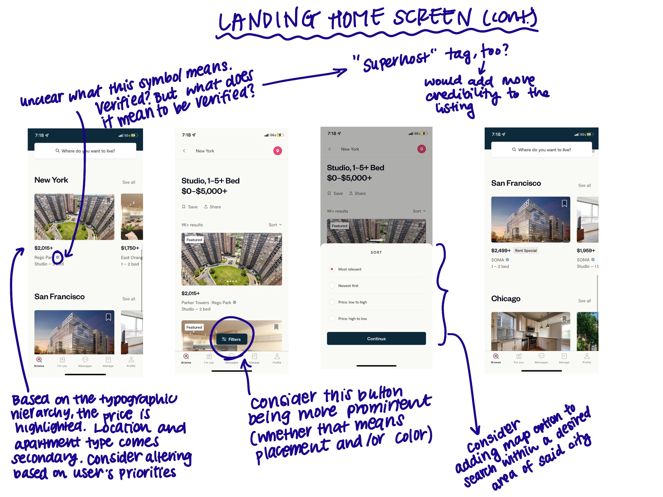
To begin, I familiarized myself with Zumper’s website and mobile app. These screenshots capture some of the iOS app’s core functionalities, such as the landing screen experience, each screen after clicking the navigation bar icons, and a sample rental listing. I jotted down my observations and initial impressions about its layout and functionality, with the goal of generating potential opportunity areas and questions to ask users.
To gather user feedback on the existing app, I read customer reviews from the App Store. Overall, Zumper’s mobile app received high reviews, with an average of 4.8 out of 5 stars from over 58,300 ratings. Yet, the following frustrations stuck out:
( 1 ) Users were being scammed, and some apartment listings were fake.
( 2 ) Some listings did not provide enough information for prospective renters to pursue them with confidence. Others were not kept up to date by rental owners.
( 3 ) Prospective renters wished for shorter response times from the property owners, and vice versa.
2 out of these 3 common complaint themes boiled down to users not being able to trust the listings. The last complaint demonstrates that users seek more interactions with other Zumper users.

Many users are being scammed! What can be done to build credibility and users’ trust?

Users are reporting that the listings are not fully updated nor provide enough information.

Users are having difficulties generating responses from renters and property owners alike.
To push my understanding of Zumper’s users’ needs even further, I conducted interviews with 6 current rental tenants between the ages of 20–25. I targeted this age range because many of these users would be renting in college or recent grads relocating. Going into the interviews, my goals were to understand the difficulties that users faced with the current renting process and how to build feelings of trust and credibility in a digital landscape.
The interviewees echoed many of the same challenges to the App Store reviews. In addition to those, they stated that different rental timelines made it difficult to find roommates and viable rental listings, and unconsolidated resources posed accessibility barriers. Word-of-mouth referrals, hearing about previous tenants’ experiences, and talking to potential roommates and landlords before committing were listed as avenues that build their trust during the rental process.
A huge thank you goes out to all the interviewees for being generous with their time and sharing their experiences!
After understanding Zumper’s users more, I identified two areas of opportunity:
( 1 ) Users do not believe the rental listings nor the property owners are credible. There is potential to build trust between users and Zumper in these interactions.
( 2 ) Users desire more interactions between themselves, others users, and Zumper. There is an opportunity to incorporate a social element that simultaneously expands the scope of the rental process that Zumper addresses.
With these opportunity areas in mind, I began brainstorming design solutions to address them. I decided to think about each opportunity area independently, as they felt distinct enough to warrant individualized solutions.

Brainstorming on how to build trust between users and Zumper.

Noodling on how to facilitate more interactions and expanding the scope of the rental process.
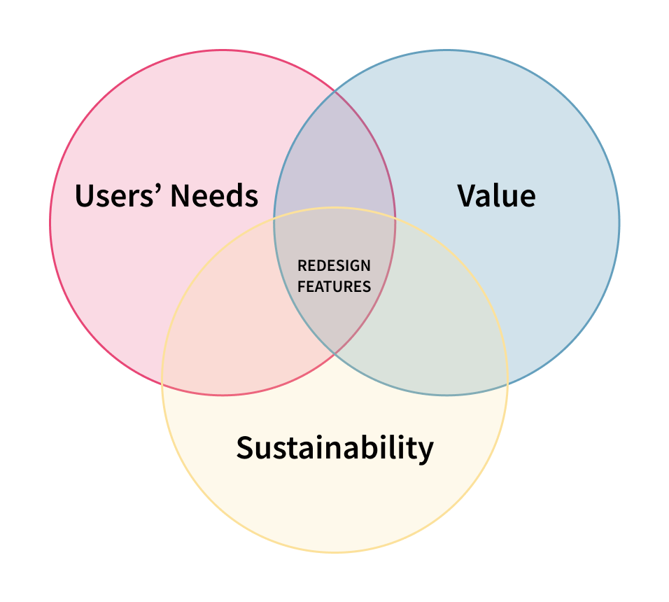
When selecting features to focus my redesign on, I kept these priorities at the forefront:
User needs: What features would address users’ needs directly and most effectively?
Value: What would generate the most positive impact and experience for users? From the business perspective, what would give Zumper an advantage over its competitors?
Sustainability: Zumper’s model depends on renters and property owners, so what would benefit both involved parties? Standalone features could potentially disrupt and be detrimental to the product, so what features would seamlessly flow with the existing mobile app’s structure and content?
I chose to move forward in the Concepting phase with the following features:
( 1 ) Featuring the blog on the mobile app: Zumper’s mobile app does not feature the blog that is available on their website. This integration onto the mobile app would provide users with an accessible avenue to interact with others and gain relevant information – something that they were seeking from my research insights.
( 2 ) More transparency on the rental listings: Information about a listing’s activity, previous tenant experiences, and the rental owner would make rental listings more credible and trustworthy.
( 3 ) Roommate matching feature: This inclusion would satisfy users’ requests for more social interaction with others and would expand Zumper’s involvement in the rental process. It would make Zumper an “all-in-one” place for all of the users’ renting-related needs.
Zumper’s web blog tags and categorizes its articles, and I wanted to translate that filtering option into the mobile app by including the topics in an accessible spot underneath the search bar. Additionally, I kept the text on the initial search screen to a minimum, included necessary pieces of information, and scaled the images to be relatively large to draw readers’ interest. In the wireframes, I paid special attention to the typographic hierarchy through the use of various font weights, grayscale colors, and point size and scaled down the images to feel more proportional to the blog copy.


I sketched out some icons that indicate the activity on a listing, a reviews section, and a colorful status symbol indicating its availability and when it was last updated by the property owner. When designing wireframes, I wanted to focus on the two most impactful actions: writing a review and reading the reviews on a listing. For the former flow, I created a pop-up notification that would appear when users whose lease ended open the app. I considered the notification pop-up because alternatives, such as slotting “Write a Review” under the Manage page, may get lost with other content or users will forget to do so.
When showcasing the reviews for a listing, I wanted to create balanced content between the ratings, written comments, and pictures. Instead of creating siloed sections that are dedicated to written reviews and pictures, I created a scrollable “feed” page where users can scroll to read the comments and view the author’s corresponding pictures. This choice flowed better, and it would address the use case of users writing about something specific and sharing a photo to supplement it.


I sketched three core screens to the roommate matching feature: a section of the survey gathering prospective renters’ rental preferences, weighing users’ priorities for a roommate, and how the generated matches would appear. In the wireframes, I split the matching survey into three stages: rental preferences, roommate preferences, and ranking priorities. I included a progress bar at the top of each screen to indicate how much more users had to fill out. In this set of wireframes, I included a screen displaying a user’s roommate matches and what a sample profile page might look like.

The screens above feature two new user states and three screens from the preferences survey.
One of the attributes I weighed when deciding which features to work on was sustainability, especially in maintaining the app’s information architecture. I identified places where I saw roommate matching feature and rating reviews features fitting in.
In the flow chart below, the column to the left represents the screens featured on the navigation bar. The middle column represents the content that is displayed on said pages. The column to the right outlines the various sections contained within a rental listing.
I conducted 7 usability tests with individuals who are between the ages of 19-27, iPhone users, and are current renters who have signed a lease within the past 12 months, to gather feedback on aspects on the redesigns. I synthesized and visualized their feedback by relative necessity and impact. Impact measured how much the suggestion or comment would be beneficial to the user, and necessity measured how the addition or change would be to the functionality of the app. This chart helped me prioritize what feedback to implement into my designs.

Plotting user testing insights by impact and necessity.
My main takeaways from the usability tests include:
( 1 ) Seemingly minor additions to the listings provided renters with much more context and added more credibility
( 2 ) Consolidating where users message property owners and potential roommates into the Messages section
( 3 ) Incorporating more detailed descriptions of the information that each section of the roommate matching survey gathers and having the option to weigh certain categories higher or lower than others.
( 4 ) Include more relevant ways to organize and present articles, such as by popularity or trending topics.
( 5 ) Change the reviews to critique the property management owner rather than individual properties for a higher response rate
I wanted to align the visual identity of the re-design features with Zumper’s brand and existing mobile app design patterns. I was unable to identify Zumper’s typeface, so I chose Source Sans Pro, which conveyed a similar sense of sophistication, minimalism, and playfulness.

Type and color specimen.
The majority of feedback that I received abut the blog revolved around the categories and how they could be organized more methodically. In my iterated designs, users can select more than one category and filter the article results. However, after reflecting upon users’ feedback, I decided to not continue concepting this feature for the final redesign. Unless the blog allows Zumper users to contribute and write their own articles, the blog would facilitate more passive forms of engagement, instead of interactions between other Zumper users.
Users felt that the dummy text was overwhelming and did not add much value to the screen other than cluttering the screen. They also provided feedback on how this feature could be implemented with the existing features of Zumper’s app, which I addressed in the next iteration.
The main revisions that I made to the roommate matcher feature were in the following functions: viewing matches, the preferences survey, and the organization of the For You page. From the usability tests, many users indicated that the messages needed to be consolidated into one section, more accessible ways to edit their personal profiles and preferences, and more categories in the survey, to name a few.


Browsing other users' reviews

Reading more reviews

User filling out their preferences for a roommate and apartment.

Complete or edit your preferences survey


Browse curated listings and preview roommate matches

View roommate matches
If I were to continue working on this project, I would consider:
( 1 ) Conducting a competitive analysis to learn how they address the same problem statements. This might include research into users’ frustrations with Airbnb’s review system and the implications of review sections on hosts and rental owners.
( 2 ) More usability tests to validate my designs and gather feedback on areas for improvement. Is there a more intuitive way to visualize the listings’ ratings, as one heart and the score to the left may be misleading? Is the pop-up notification too disruptive to the experience?
( 3 ) Concepting more functions of the re-designed features: Some ideas include a keyword search option within the reviews, reacting to reviews that are particularly helpful, viewing the reviews by the most helpful/lowest rating/highest rating, a FAQ section for prospective renters, and updating the listings with an average response time.
( 4 ) More research on the implications of having users select their roommates, especially if the roommate profiles include photos and links to their social media accounts, and explore how to ensure an equitable experience for all users of that feature.
( 1 ) The importance of scoping: I struggled to narrow down the features that I wanted to focus on and wished I could tackle each idea. As I began wireframing and iterating, I soon realized that maintaining a narrow focus would allow me to hone in on the minute details that would result in a quality product.
( 2 ) Grounding decisions in data and feedback: After each user interview, I gained a better perspective on parts that are effective and not translating well in the experiences, and it felt like I was progressing at exponential rates. The collected data, even conflicting feedback, defined the direction of the project and continuously reminded me to evaluate whether each aspect responded well to the problem statement.
( 3 ) Learning to work within the non-linear design process: Coming to this project, I had no exposure to Zumper. I am also a fairly inexperienced renter. I spent large chunks of time throughout this challenge researching, conducting interviews, and spending time in Zumper’s mobile app to understand what users needed. At first, I was frustrated that I was “wasting time” instead of “designing.” In the end, I embraced the process of gaining a holistic understanding of the problem space, as it directed my work and made for a more compelling redesign experience. I also realized that “product design” isn’t limited to the visuals; it is much more expansive and entails research, understanding behavior, and more.